This is a decidedly non-policy post, but I figured it’s fitting nonetheless. My office at FWS is still pretty sparse. Taking the metro to work everyday does not lend itself to bringing decorations. However, one of the few things that have made it was this:
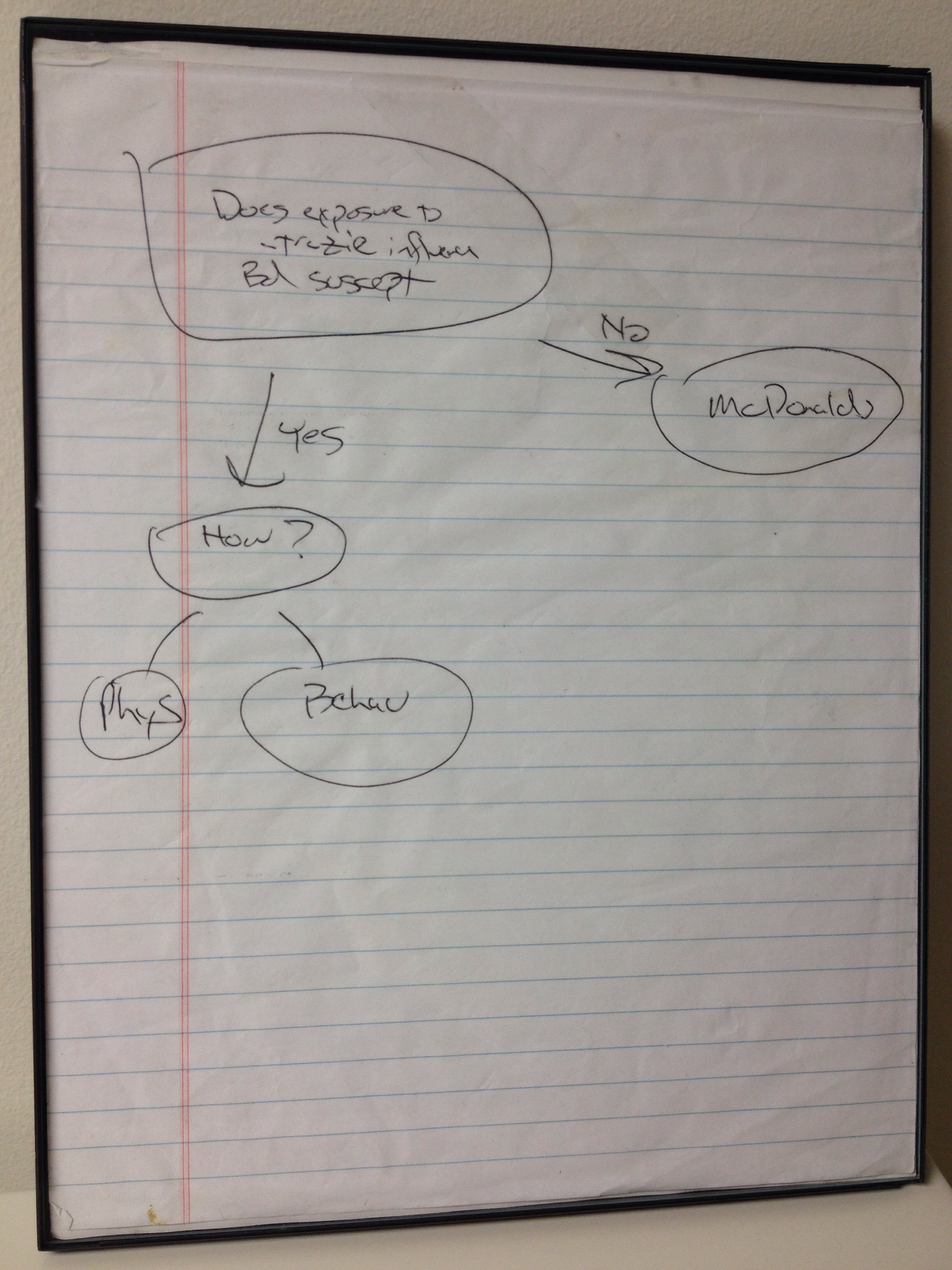
If you can’t read it, it’s a flow chart that basically mapped out my future. On my first day of grad school, I met with my advisor. He pulled out a piece of paper and wrote this. The main bubble says, “Does atrazine affect chytrid susceptibility?” Basically, does a pesticide alter host-pathogen interactions in hosts (I.e., my dissertation). The chart flows to two points, yes or no. The “yes” arm goes to things such as “Phys(iology)” and “Behav(ior)”. These were obviously just initial suggestions off which my graduate (and likely further) career was/will be based. What I really took seriously was the “no” arm. No interactions? Well, that meant a career at McDonalds.
Obviously my research wasn’t that cut and dry, and obviously my advisor didn’t think I was doomed if I didn’t find any interactions. But having said that, it was a humorous way to get me motivated. Not all my research worked out the way that I planned, but that’s why we do research. There would be no point if we knew all the answers.
